



A landing page that sells has 10 sections in this order: hero, quick proof, problem, solution or services, how it works, about you, testimonials, pricing, FAQ and a final call to action with contact. Each one answers a client's question before they ask it. Leave one out and the client goes looking for the answer elsewhere, and often doesn't come back.
A landing page isn't a full website: it's one page with one goal, like getting a message, a sale or a booking. Here is what goes in each section and which mistakes to avoid.
What is a landing page, and how is it different from a website?
A website has several pages and many paths. A landing page has one page and one important button. That is why it works so well for ads, Instagram bio links and launches: no distractions.
The 10 sections of a landing page that sells
- Hero. What you offer, who it's for and the main button, all visible without scrolling. More in anatomy of a hero section that converts.
- Quick proof. Client logos, orders delivered or a rating. One line is enough.
- The problem. Describe what your client is going through, in their words.
- Services or product. What's included, in short cards. Benefit first, feature second.
- How it works. Three or four steps. It removes fear of the unknown.
- About you. A real photo and a paragraph. People buy from people.
- Testimonials. Real, with names and photos if possible. Three specific ones beat ten vague ones.
- Pricing. Clear, with what each plan includes. Hiding prices creates distrust.
- FAQ. The questions people send you on WhatsApp, answered up front.
- Final call to action and contact. Repeat the main button and make it easy to reach you.
What order should the sections go in?
The order follows the client's questions: what is it?, is it for me?, does it work?, what's the process?, who's behind it?, how much?, what if…? People scan before they read: Nielsen Norman Group's research on the F-shaped pattern shows they read the start of headings and paragraphs. Every section needs a heading that makes sense on its own.
What makes a landing page convert?
- One goal. One main button, repeated. Not ten links.
- Speed. Slow on mobile means people leave. Google explains what it measures in its Core Web Vitals.
- Mobile first. Most visits come from Instagram or WhatsApp, which means a phone.
- Copy in the client's words. Not "end-to-end solutions" but "your website live in 10 days".
Common mistakes
- A hero that doesn't say what you sell. "Welcome" tells nobody anything.
- Fake testimonials. People notice, and trust is gone.
- Long forms. Ask for name and phone; the rest can wait.
- No prices or ranges. Clients assume it's expensive and leave.
Also read 5 mistakes quietly killing your website: they apply to landing pages too. If you are building it yourself, follow how to make a landing page in Canva.
Frequently asked questions
Between 7 and 10. The essentials are the hero, benefits or services, social proof, FAQ and a final call to action. The rest depends on what you sell.
Yes. Canva can publish a design as a website. For more control, speed or your own domain, an HTML version on your hosting is a better fit.
A landing page is ideal for selling one service or product, or for ads. With several services, a blog or a store, you need a full website.
After showing the value: services, process, about you and testimonials. By then the client understands what they're paying for.
Wrapping up
A landing page that sells doesn't depend on spectacular design, but on answering the client's questions in the right order. Ten sections, one goal, clear copy.
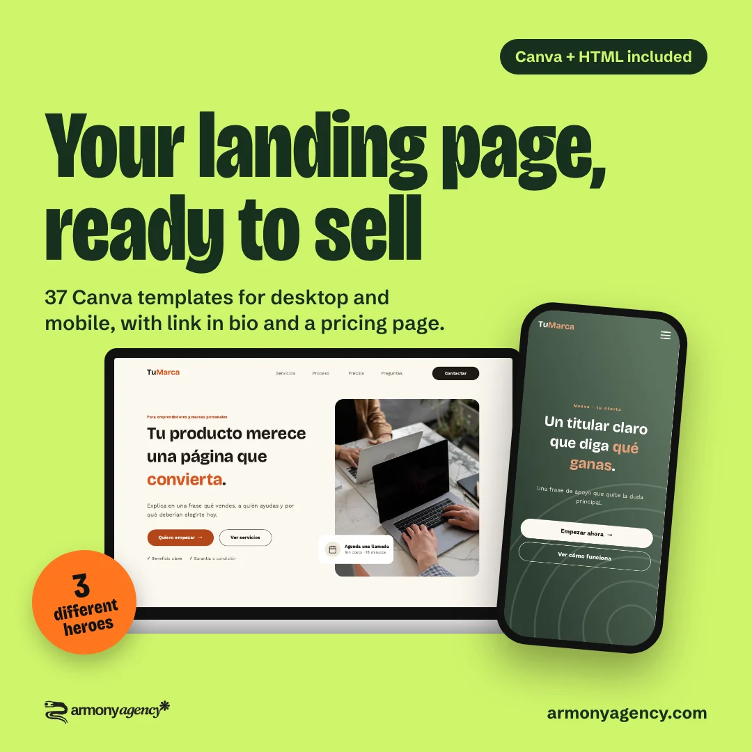
Start today: the Solara Landing Page Kit includes all 10 sections for desktop and mobile, editable in Canva, plus the HTML site ready for your hosting. Would you rather we build it with SEO and speed? See our web design service in Panama and real projects.